We have seen gorgeous landing pages fall flat and plain-looking ones quietly outperform them. When a page does not convert, the cause is rarely the colour palette. It is almost always the structure: what the page asks the visitor to do, and how many obstacles stand in the way.
One page, one goal
The most common mistake is a page trying to do three jobs at once: sell a product, grow a newsletter, and recruit. Pick the single action that matters most and remove anything that competes with it. Secondary links can live in the footer.
Say what you do in the first screen
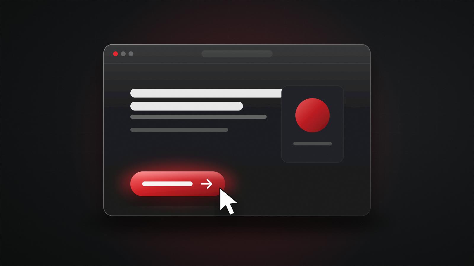
You do not need everything above the fold, but a clear headline and an obvious next step must be visible immediately. A visitor should understand what you offer, who it is for, and what to do next within a few seconds, without scrolling.
Earn trust with specifics
Vague claims like 'world-class' or 'cutting-edge' do nothing. Specifics do: what exactly is included, how long it takes, what it costs or where pricing starts, and real examples of work. Honest detail builds more trust than superlatives.
Remove friction everywhere
Every extra form field, every unclear button, and every moment of doubt about what happens after clicking costs conversions. We review each landing page by counting the decisions a visitor has to make before converting. Fewer is almost always better.
Make it fast
A landing page that takes too long to appear loses people before they read a word, especially on mobile. Performance is part of conversion design, which is why we build lean pages with optimised images and minimal scripts.