Fluxa
Global money, made effortless.
A marketing website for a global business-payments app: multi-currency accounts, smart team cards and international payouts, designed and built mobile-first with its own design system.
The challenge & the answer.
Fintech sites tend to sound the same: big claims, stock photos and long feature lists. A business owner should understand what the product does, what it costs and why it's safe within the first few scrolls.
A confident, product-led site where the first screen explains the offer, a bento grid shows the product instead of describing it, pricing is simple to compare, and every section is built to feel just as good on a phone.
Inside Fluxa.
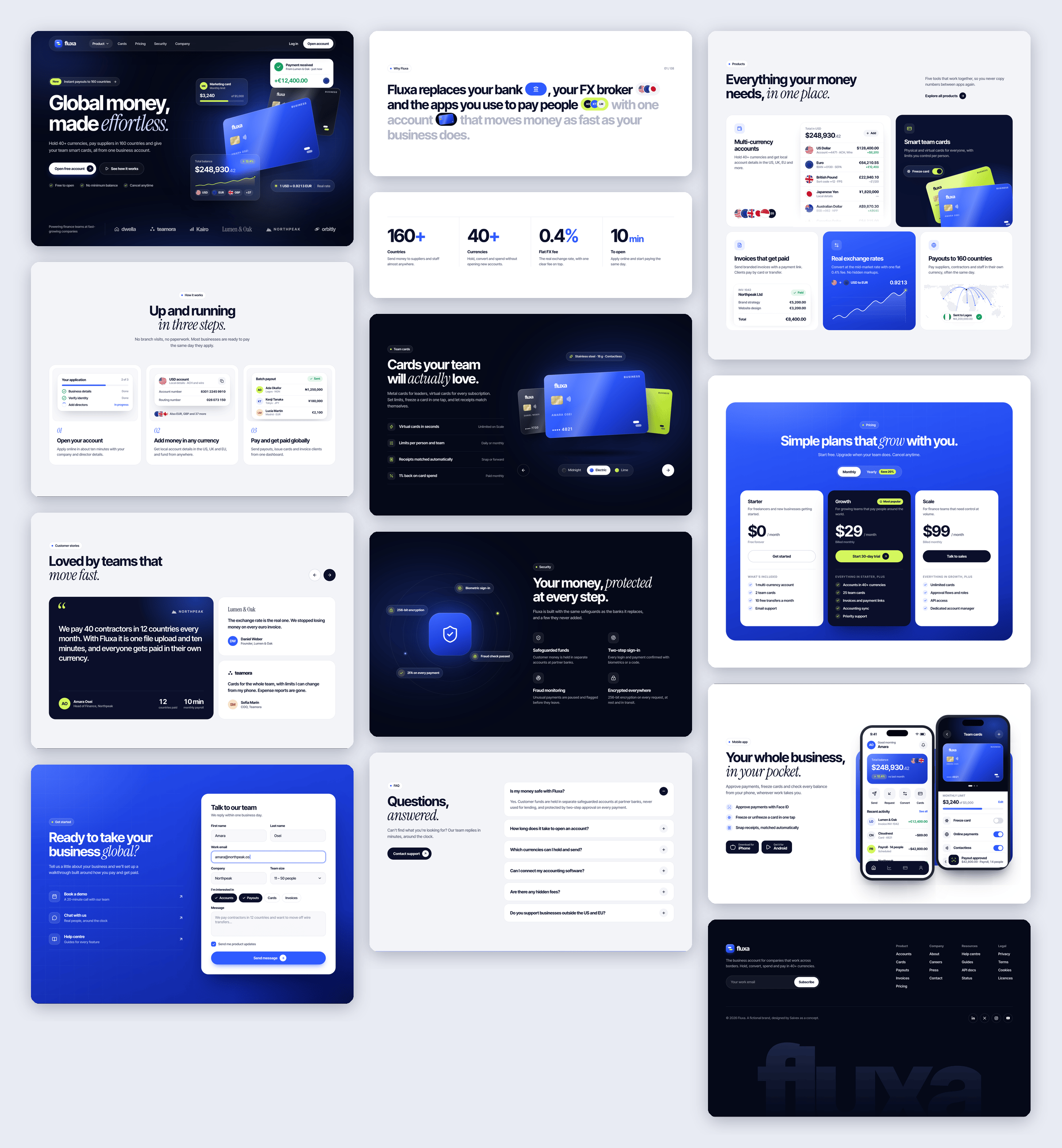
4 core screens, each designed around the one job it has to do well.
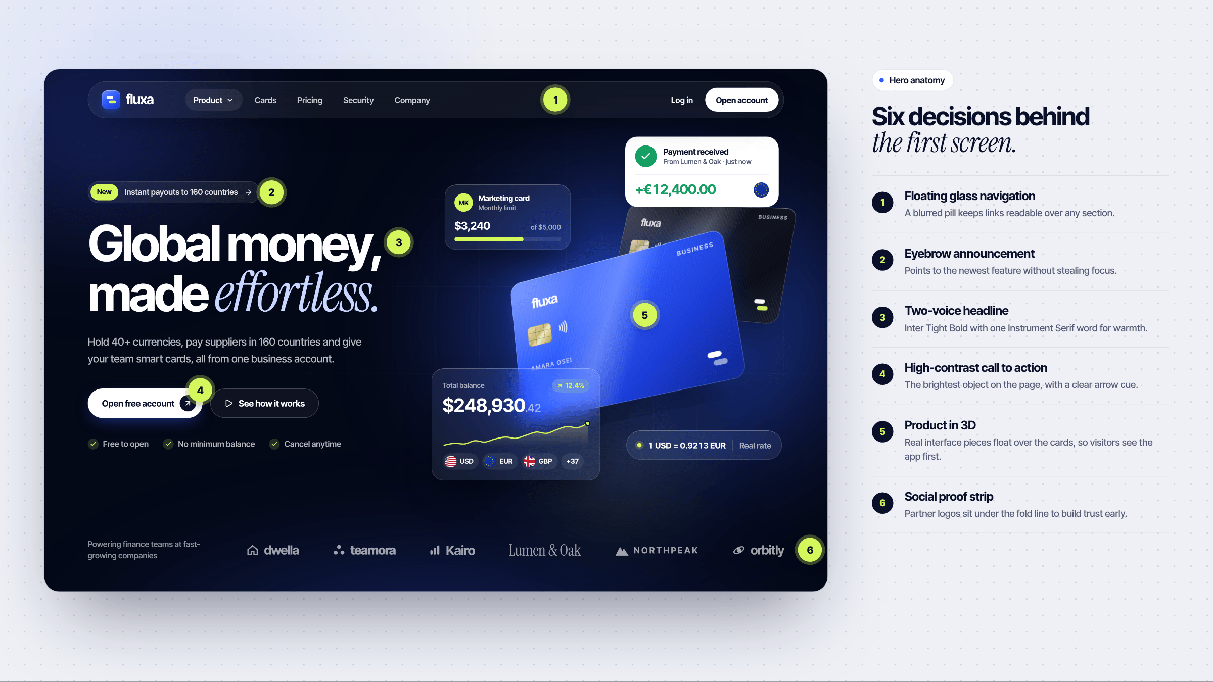
Six decisions behind the first screen.
Floating navigation, a clear announcement, a two-voice headline, one high-contrast call to action, the product in 3D and a strip of social proof, all above the fold.
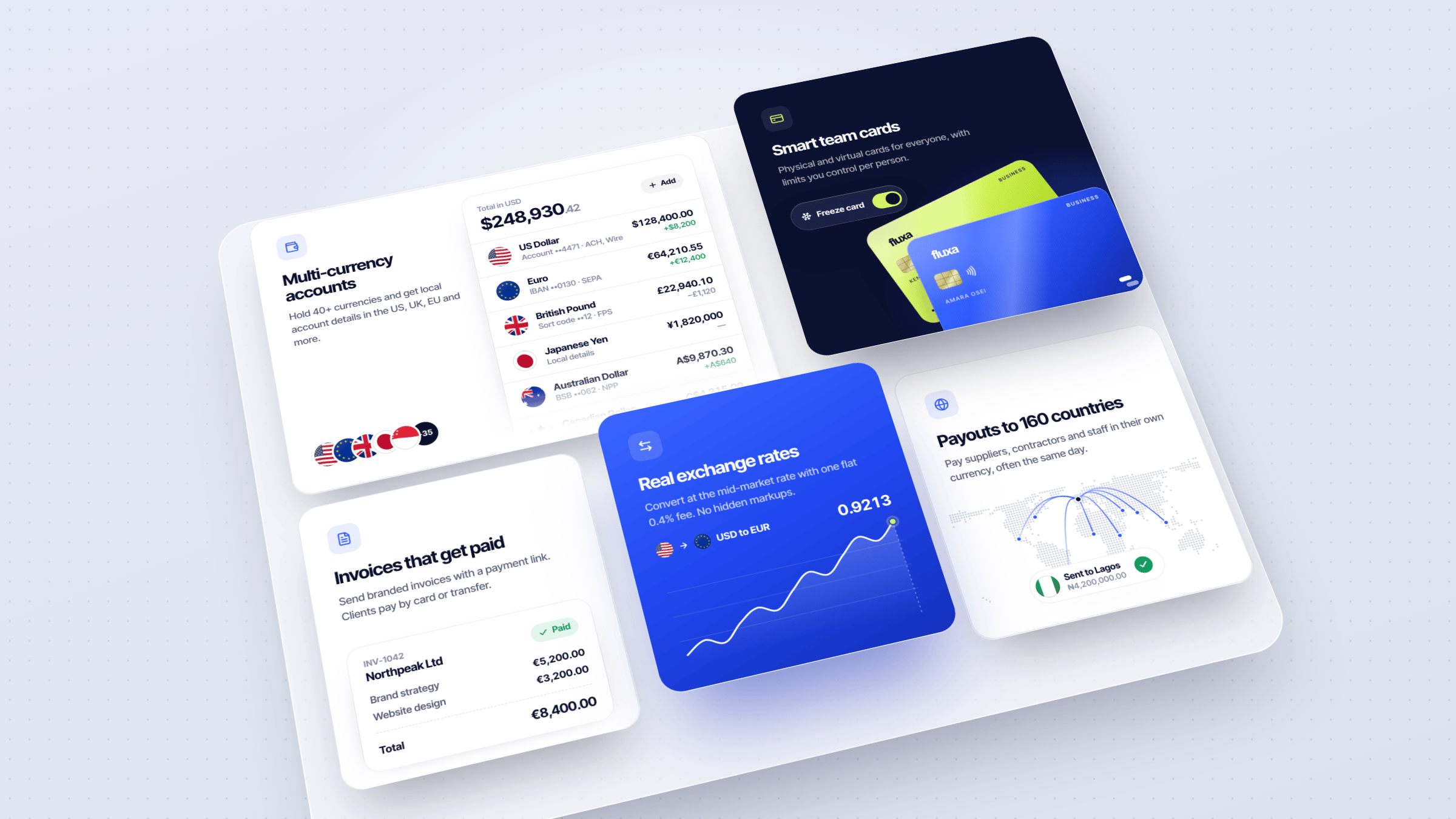
Everything your money needs, in one place.
A bento grid that shows the product working: multi-currency accounts, smart cards, invoices, live exchange rates and payouts.
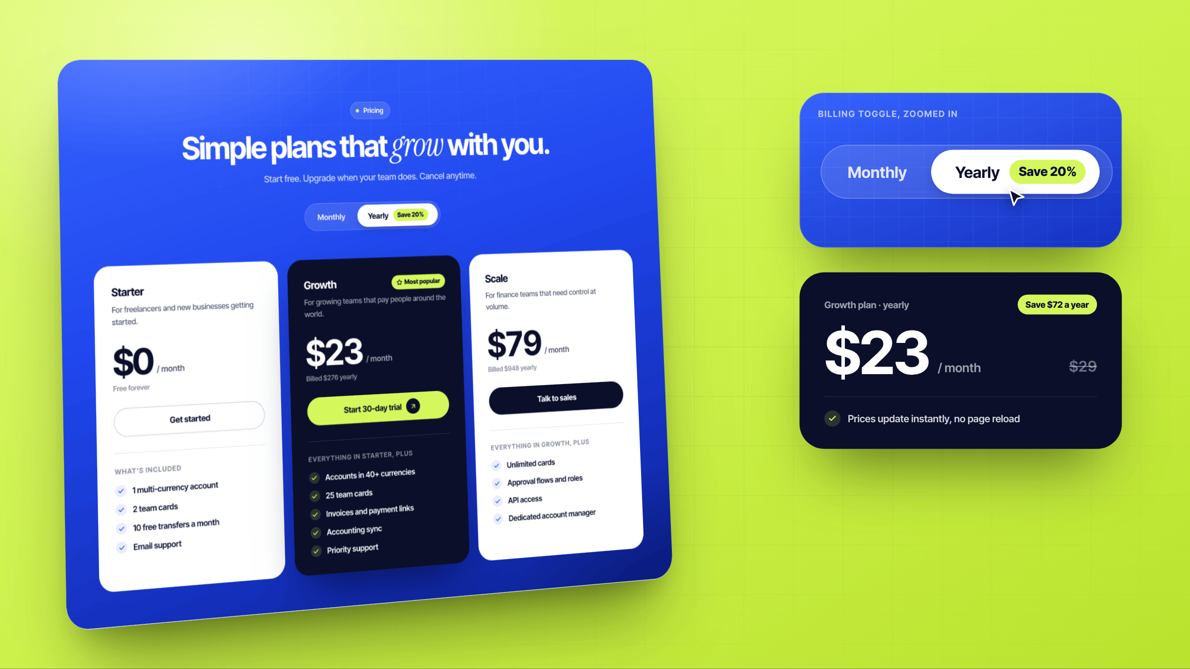
Simple plans that grow with you.
Three clear plans and a monthly/yearly toggle that updates prices instantly, with the savings called out.
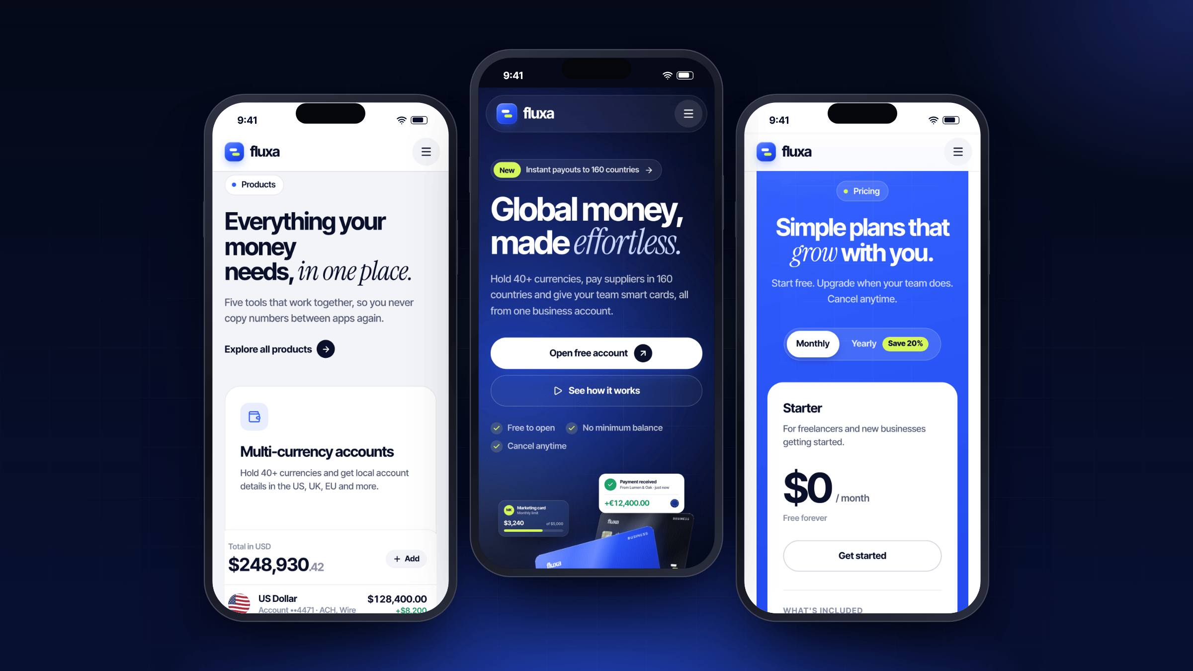
Your whole business, in your pocket.
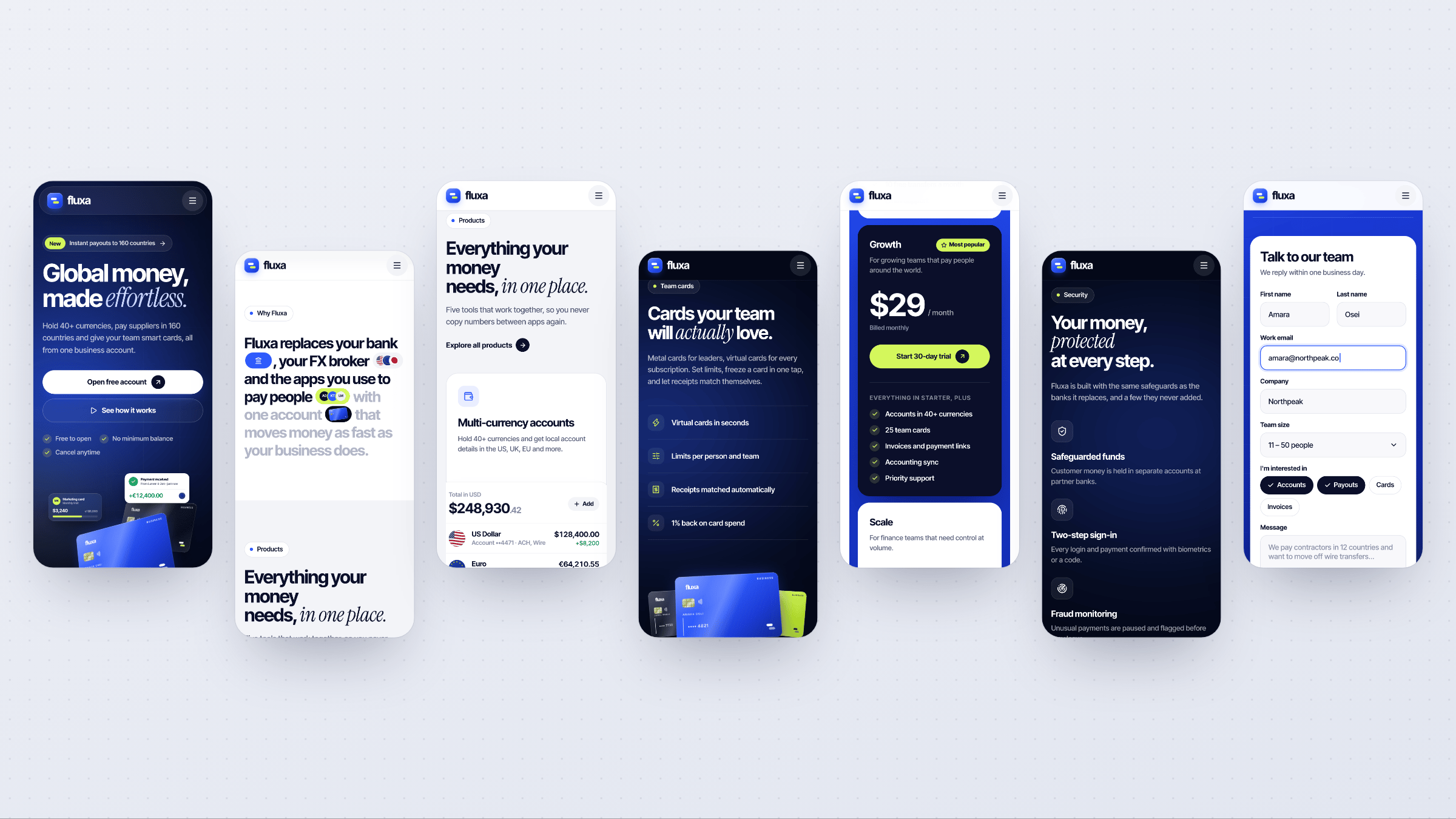
Every section re-composed for small screens rather than squeezed, from the hero to pricing.
The finer details.
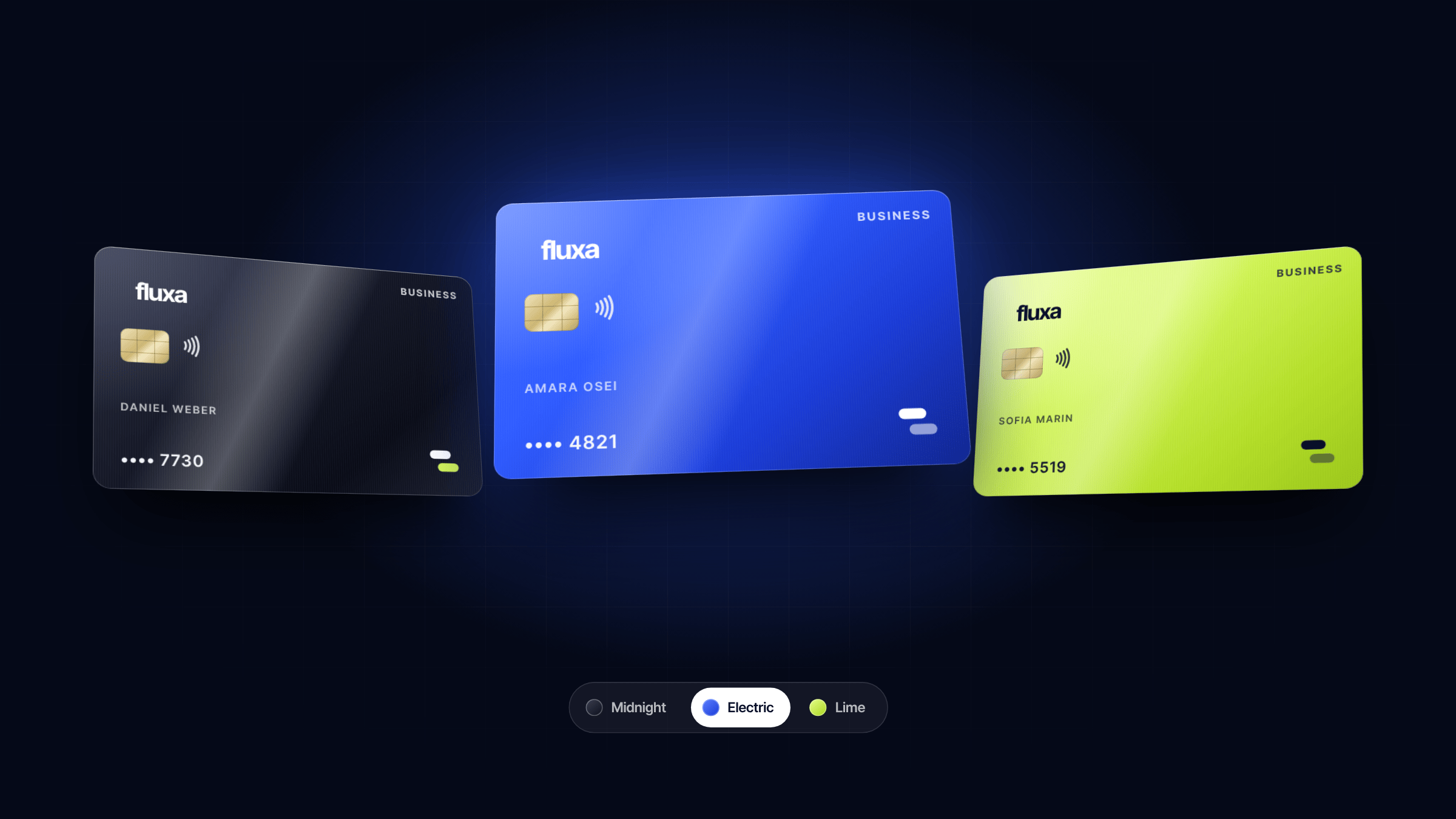
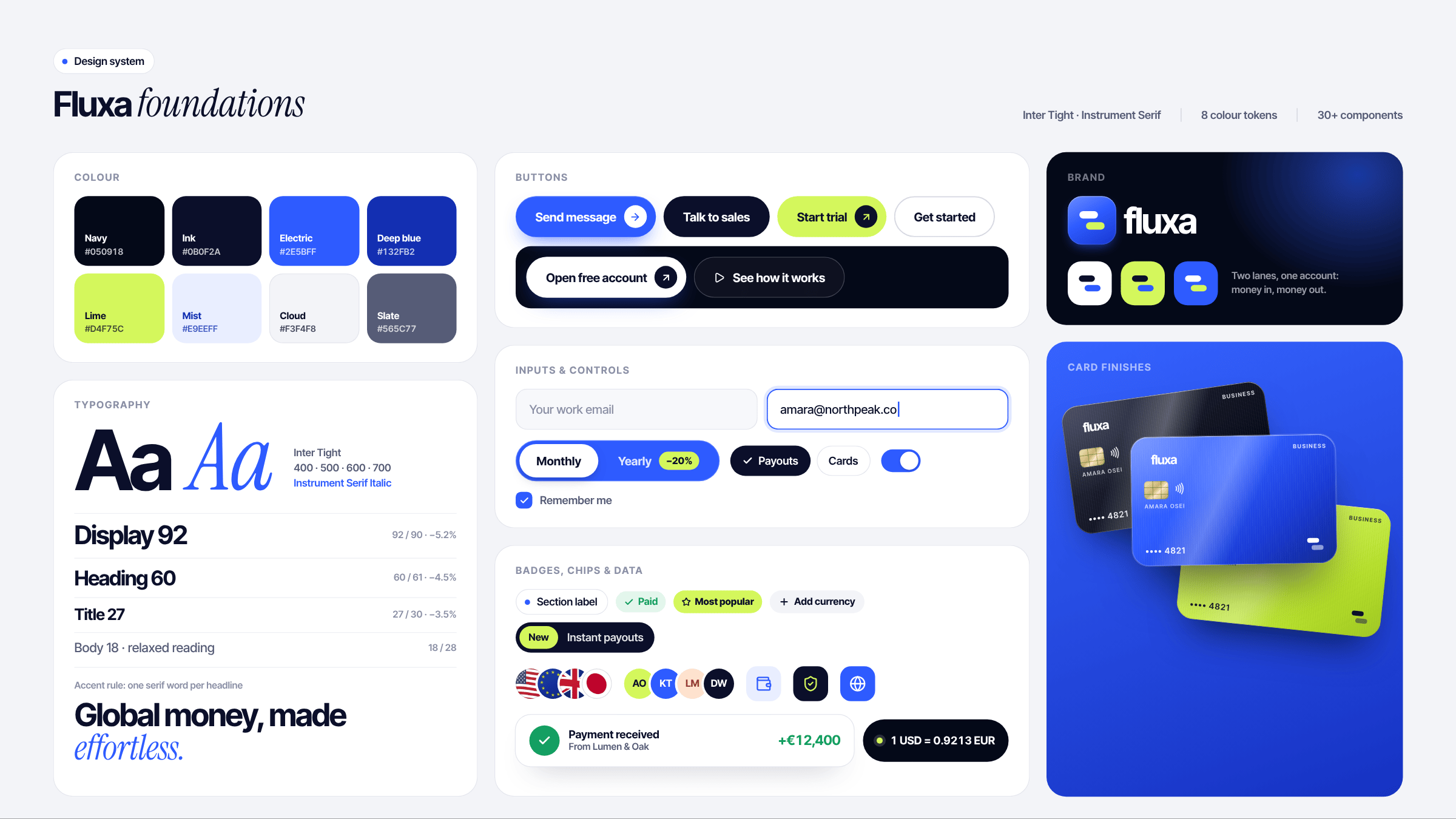
Design system, mobile screens and the moments in between.
At a glance.
A self-initiated studio concept: no client metrics, just what's inside.
Stop Dreaming.
Start building.
Every day you wait is a day your competitor launches. Let's engineer your digital presence and make it impossible to ignore. Web design, web development, CMS, and mobile apps — projects start at just $200.